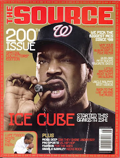
 Denotation- The magazine consists of a man looking at the camera. It is a close up of his head.
Masthead- The source masthead is simple as it uses a bold text which is in red. This corresponds to the colour scheme the magazine is trying to pull off. The masthead uses a bold and rounded font with a white outline which creates it to it being more eye catching for the readers.
Character- The cover is a photograph of a famous hip-hop rapper called Ice Cube
Composition- The focus is concentrated more on the face of ice cube so that we can clearly see that his facial expression is screwed up, this relates back to its target audience to which the music comes with a stereotypical appearance to look in a certain way.
Costume- His clothing suggest he is a young person or relatable to the young generation as he wears relatable and fashionable clothing. He is dress in a black American football hat and a black plain top which is fashionable for the target audience. This colour is chosen as it is associated as a ‘cool’ and significant colour amongst the hip-hop fans. This will draw readers by using this clothing and this hip hop icon that is socially accepted by people who listen to this genre. There are also parts of this clothing that connotes wealth as he wears a long chain, diamond earrings and diamond teeth. The jewellery contrasts with the dark clothing he is wearing to show clearly the expensive items. The connotations of the jewellery correspond to the target audience’s imagery of an American hip-hop artist. He is also holding a cigarette and holding it in a ‘show off’ manner. The cigarette connotes that he is rich as the target audience imagine people with them to be business people. Wealth is used a lot in this photograph to connote prosperity in this genre of music.
NVC- He is posed in a casual yet intimidating way as the main image is a mid-shot focusing on his facial expression. His eyebrows are tensed giving him an aggressive appearance. His facial expression portrays the hip-hop genre to be a demanding and brutal business.
Lighting-The lighting is high key so that it contrasts with the dark appearance of the character. The lighting is situated around his face and as it comes closer to the centre it becomes dark connoting a sinister look to correspond with his facial expression.
Setting- The setting is replaced with a block colour however the brown colour used creates a simple theme being used so that it does not draw attention from the main subject of the magazine.
Cover lines- The main coverline refers back to the character. The main coverline is made more important and separated by the other coverlines by using a bigger font, different colour and centralising the text. This gives it the public interest it is trying to achieve as the unique font chosen states the characters name in red, a colour that connotes watchfulness, placed in the centre. There is a smaller text included in the main coverline, ‘started this gangsta ish!’ this text uses informal language to relate to its target audience by using this short, quote-like main coverline. The use of the exclamation mark allows the reader to imagine that this is what the character is saying. At the bottom of the front page there is a coverline that shows different stories that are going to be included in the magazine. This draws a wider target audience by stating the different articles. This is created to build excitement for the reader as it is placed in a list stating four different topics. One topic draws reader into looking into an artist, ‘can they shine under 50’, this is shown in a different colour to the artists name and uses a rhetorical question to appeal to its target audience.
Target audience- The target audience are listeners of the hip-hop genre. These tend to be people that are between the ages of 15-30
Target audience- The target audience are listeners of the hip-hop genre. These tend to be people that are between the ages of 15-30
No comments:
Post a Comment