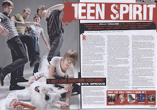
 Colour scheme: The colour scheme is kept to a minimum as the page containing the article uses 3 colours in the presentation. This basic scheme allows it to be easy to read and not look like a page contains too much information as the article itself has a lot of text. Although the colour scheme is simple it applies to its target audience by displaying an urban connotation with the splash of colour in the form of paint.
Image: The denotation of the image is the band fighting a person in a cartoon rabbit’s costume. The costume the band is wearing is casual seeing that they are in shirts and jeans. The colours of their costume are dull yet appealing to there target audience which are listeners of the math core genre. The dullness of their costume is like this so that it does not become too colourful that tit clashes with the articles colour scheme.
Subject name: Is positioned in the top right hand corner stating the name of the band being addressed visibly.
Quotes: The quote is the second largest text on the page, catching the reader’s eye. It is also situated on the lower 3rd in the centre of the double page spread overlaying the main image and breaking up a column in the article, which can also display its importance clearly.
Stand-first: the font size is large and is white however it not deterring from the headline. It is also very eye catching as it is on a black strip and the main singer name of the band is highlighted by using the colour red drawing readers to read the article.
Drop capital: The drop capital is large taking five lines of the article. It is also in the colour red which makes it more engaging as it is on a white background therefore clearly showing the start of the article. The proceeding paragraphs show two words in drop capital in a slightly larger font to the rest of the text in the columns. The purpose of this is to find a different paragraph without difficulty.
Headline: The headline is in a large white font on a read strip. The headline saying, ‘TEEN SPIRIT’ relates back to the readers and goes with the style of music the band produces.
By-line: This is positioned under the strap-line
Columns: There are 3 columns in the article breaking up the large amount of information being placed. The font is Times New Romans which connotes formalness towards the article.
No comments:
Post a Comment